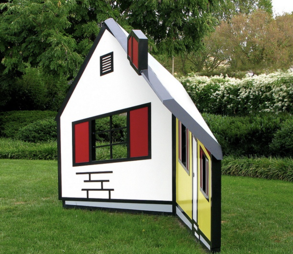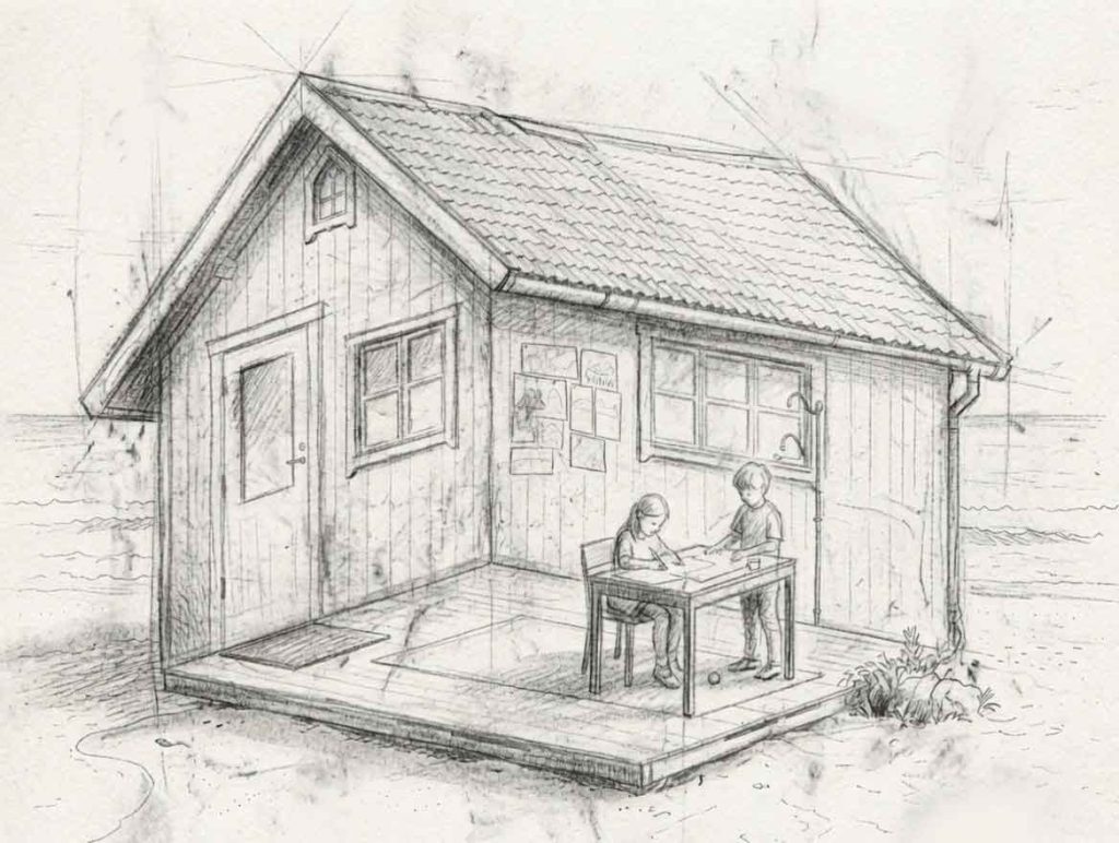
With summer just around the corner, I find myself drifting back to the shores of time, to this delightfully impossible little structure perched on the beach.
A drawing concept created for a children’s coloring book on optical illusions. Over the years, I’ve explored this theme through many curious and playful variations.
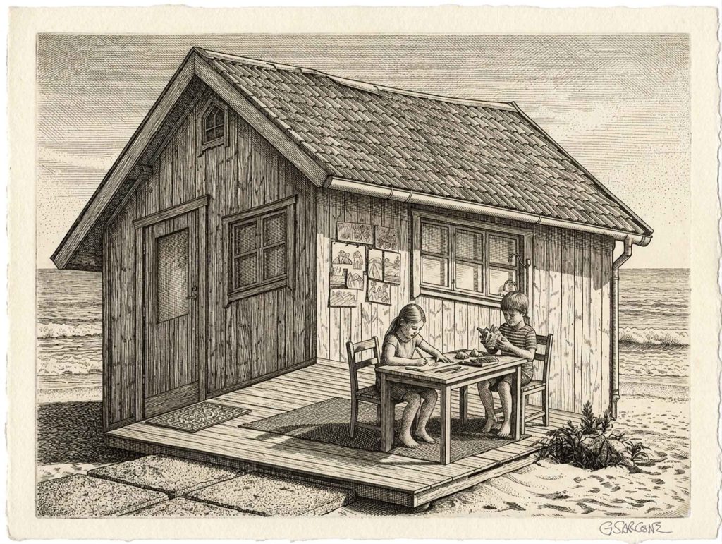
Are the kids engaging in creative activities inside the cabin or outside it?
The roof insists we’re looking at the exterior, while the floor pulls us firmly indoors. Both readings feel correct, yet they cancel each other out. So, there’s no clean resolution here—just a quiet visual paradox.
Curious to see more of my optical illusion book concepts, impossible worlds, and mind-bending creations? Take a stroll through my author page.
The idea itself is far from new and has inspired countless artists, architects, and photographers. It even exists in three dimensions. A notable example is Roy Lichtenstein‘s House I (1996), an ingenious sculpture that appears to be a solid house but is actually a concave construction made of angled steel planes. As viewers move around it, the structure seems to rotate and reshape itself, turning perception into part of the artwork.